Nuerolytica

Brand Nuerolytica Consulting is a deep-tech and consulting company based in India, working across AI/ML, robotics, quantum, cybersecurity, and industrial solutions. Our task was to build a clear, modern brand presence that feels trusted by enterprises and governments—and easy to understand for website visitors.Deep-tech consulting, AI & robotics, quantum research, cybersecurity services, industry transformation. Challenge Nuerolytica already had a logo (not designed by us). Everything else needed to be aligned—website, print materials, reports, pitch decks, proposals, business cards, and event collateral. The identity had to look premium yet practical, communicate complex tech simply, and perform well on search with fast load times, clean structure, and strong keywords. Solution Wawdler developed a complete, scalable brand system around the existing logo. Delivery Toolkit: brand guidelines, component library, master deck, and print-ready templates so internal teams can produce new assets quickly and consistently. Design System: typography pairs for clarity, modular grids, iconography, diagram styles, data-viz templates, and a versatile color palette that works in light/dark modes. Website (UI/UX + SEO): streamlined navigation, fast pages, semantic headings, schema markup, image compression, and on-page keywords mapped to services and industries. Clear CTAs drive demo/consultation requests. Content & Messaging: short, benefit-led copy blocks for capabilities (AI, quantum, cybersecurity), sector pages, and case studies. Tone of voice: precise, confident, no jargon. Collateral Suite: brochures, whitepaper/report layouts, proposal decks, one-pagers, conference flyers, ID cards, tote and packaging mockups—each using consistent grids and accessibility standards. Result Nuerolytica now presents one coherent story across web and print—credible, clean, and conversion-ready. The site is faster and easier to navigate, helping visitors find the right service in fewer clicks. Search pages are optimised for high-intent queries (AI consulting, quantum research, cybersecurity advisory), supporting steady growth in qualified leads. Sales teams use unified decks and proposal kits that speed up responses and raise win-rates.In short: one brand, many touchpoints—professional, trustworthy, and built to scale.
Cybersault Systems

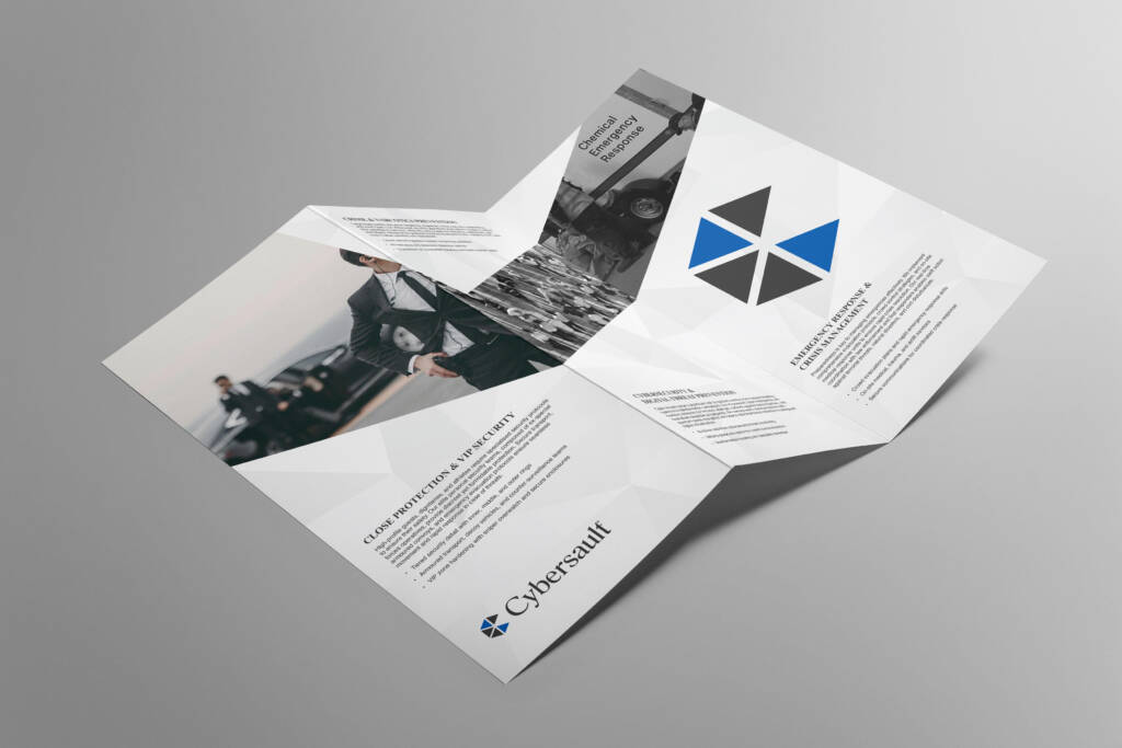
Brand Cybersault Systems is a global aerospace and defence technology company. Our goal was to give the brand a clear, modern identity that says “secure, precise, and reliable.” We built a brand that feels trusted by governments and enterprises, yet easy for visitors to understand. Keywords: aerospace & defence, security technology, trusted innovation. Challenge Cybersault needed one strong brand across every touchpoint—logo, website, print, proposals, and product docs. The look had to be confident but not aggressive, technical but still human. It also had to work in dark and light modes, be accessible, and rank well on search for terms like “aerospace defence technology,” “integrated security,” and “mission-ready systems.” Solution Wawdler created a complete brand system. Print & Docs: spec sheets, field manuals, ID badges, and shipping marks—consistent grids and legible layouts. Logo & Symbol: a clean mark that blends flight and shield—protection in motion. Typography & Colors: readable type for specs and proposals; deep navy/graphite with crisp signal accents for hierarchy. Website (UI/UX + SEO): fast pages, clear navigation, schema markup, optimized headings, and on-page keywords (aerospace, defence systems, integrated security, advisory). Content Playbook: concise voice, benefit-led messaging, reusable modules for case studies, RFPs, and product sheets. Result The new identity makes Cybersault look and feel mission-ready across web and print. Site speed improved, bounce rates dropped, and key pages now target high-intent keywords with clear calls to action. Sales and procurement teams use unified templates that shorten response time. The brand shows up everywhere with one voice—credible, modern, and easy to trust—turning website visits into qualified leads and conversations.
LadakhInLuxury

Brand Ladakh in Luxury curates high-end journeys across Leh, Nubra, Pangong, Turtuk, and Hanle—private stays, safe transport, and thoughtful experiences at altitude. The promise: raw Himalayas, delivered with comfort. Luxury Ladakh tour, Leh boutique hotels, Nubra Valley luxury, Pangong lake stay, Hanle stargazing, private Ladakh itinerary. Challenge Premium Ladakh travel info online is scattered and generic. The brand needed a clear identity and a conversion-ready website that: Solution We (Wawdler) built the brand system and website end-to-end—without changing the existing logo. Brand System: calm neutrals with Ladakh sky and sand accents; readable typography for mobile; photo style that favours human moments (monasteries at dawn, double-humped camels at dusk, stargazing in Hanle). Tone: warm, clear, practical. Website (UI/UX + SEO): fast pages, clean menus, H1–H3 structure, internal linking, schema markup, compressed images, and descriptive alt text. Location-rich copy mapped to routes (Leh → Nubra → Pangong / Tso Moriri). Itinerary Library: 5, 7, 9-day plans with highlights, acclimatisation guidance, “What’s Included,” “Best Season,” and add-ons (private guide, photographer, oxygen support, boutique camps). Trust & Conversion: visible CTAs, WhatsApp handoff, smart enquiry form (dates, group size, comfort level), safety notes, packing list, and FAQs (permits, AMS, road closures). Result The brand now feels premium, trustworthy, and easy to book. Visitors reach the right itinerary in fewer clicks, spend longer on key pages, and submit better-qualified enquiries. Core pages target keywords like “luxury Ladakh tour,” “Valley luxury stay,” “Pangong lake itinerary,” and “Hanle stargazing tour,” improving organic visibility and conversions.Outcome: one consistent identity across touchpoints and an SEO-smart website that turns inspiration into confirmed trips—built for altitude, comfort, and unforgettable views.
KashmirInLuxury

Brand Kashmir in Luxury curates high-end travel across Srinagar, Gulmarg, Pahalgam, and Sonamarg—boutique stays, private transfers, and thoughtfully designed experiences. The brand promise is simple: Kashmir’s beauty, delivered with comfort and care. Luxury Kashmir travel, boutique stays Kashmir, honeymoon packages Kashmir, private houseboat Srinagar, Gulmarg winter tours, Pahalgam luxury itinerary. Challenge Information about premium Kashmir travel was scattered and generic. The brand needed a clear identity and a conversion-ready website that: Attracts high-intent searches like “luxury Kashmir tour,” “private houseboat Srinagar,” and “Gulmarg honeymoon.” Feels elegant but friendly. Explains itineraries, inclusions, and seasons in simple language. Solution Wawdler developed a complete, scalable brand system around the existing logo. Brand System: refined color palette inspired by chinar leaves and lake blues; modern, readable typography; photography guidelines that highlight people-first moments (shikara sunsets, snow mornings, kahwa rituals). Voice: warm, clear, no jargon. Website (UI/UX + SEO): fast pages, clean menus, H1–H3 structure, internal linking, schema markup, compressed images, alt text, and location-rich copy. Itinerary Library: ready templates for 3, 5, 7+ day trips with highlights (houseboats, gondola, saffron fields, meadows, heritage walks), “What’s Included,” “Best Season,” and add-ons (private guide, photographer, special dinner). Trust & Conversion: visible CTAs, WhatsApp handoff, enquiry forms (dates, guests, interests), FAQs (permits, weather, outfits), and review snippets. Result The brand now feels premium, honest, and easy to book. Visitors find the right itinerary in fewer clicks, spend longer on key pages, and submit better-qualified enquiries. Search performance improves for keywords like “luxury Kashmir tour,” “Srinagar houseboat luxury,” “Gulmarg honeymoon,” and “private Kashmir itinerary.”Outcome: one consistent identity across touchpoints and a fast, SEO-smart website that turns inspiration into confirmed trips.
Glamtreks

Brand Glamtreks blends comfort and adventure—think scenic trails, boutique stays, and stress-free planning. Tagline: “Glamour in Nature.” We built a warm, modern brand that attracts couples, families, and small groups who want beautiful treks without roughing it. Aluxury treks, glamping treks, guided hikes, boutique adventure travel, Himalayan treks, nature getaways, eco-friendly tours. Challenge Glamtreks needed a single, premium identity across every touchpoint—logo, website, itineraries, booking forms, brochures, and social. The brand had to communicate “easy luxury in nature,” show clear routes and inclusions, and rank for high-intent keywords (e.g., “luxury trekking,” “glamping near me,” “guided Himalayan treks”). We also had to reduce enquiry back-and-forth with clearer info, pricing logic, and FAQs. Solution Wawdler developed a complete, scalable brand system around the existing logo. Logo & Visual System: elegant wordmark with a trail-slash motif; earthy neutrals with a signature accent; accessible type for mobile reading. Website (UI/UX + SEO): fast pages, simple navigation, itinerary templates (weekend, 3–5 day, signature), schema markup, clean H1–H3 structure, internal linking, compressed images, and alt text. Clear CTAs for “Plan Your Trek” and “WhatsApp Us.” Content & Messaging: short, benefit-led blocks—difficulty levels, inclusions, packing lists, best season, safety, and sustainability. Blog topics mapped to search: “best beginner treks,” “glamping packing list,” “how to choose trek shoes,” “family-friendly hikes.” Booking Flow: step-by-step enquiry form (dates, group size, comfort level), transparent pricing tables, add-ons (private guide, photographer, boutique camp), and automated email templates. Collateral Suite: printable brochures, trail maps, room/camp cards, transfer tags, guide badges, and social templates for seasons, sightings, and guest stories. Result The brand now feels premium, friendly, and easy to book. Visitors land on itineraries in fewer clicks, spend more time on key pages, and submit enquiries with the right details. Pages targeting “luxury treks,” “glamping treks,” “guided Himalayan treks,” and “boutique adventure travel” are better optimised, helping organic visibility and conversions.
Emerging Technology Professionals Association

Brand Emerging Technology Professionals Association (ETPA) is a global community for AI, blockchain, cybersecurity, quantum, and other deeptech fields. We built a modern, trusted identity that makes complex topics easy to understand and act on—certifications, training, and industry connections.Deeptech certification, AI certification, blockchain training, cybersecurity courses, quantum computing programs, tech ethics, professional association. Challenge ETPA needed one unified brand across everything—logo, website, course pages, certifications, events, partner decks, and member materials. The identity had to feel credible to universities and enterprises, friendly to learners, and be optimised for search with fast load times, clear structure, and high-intent keywords. Solution Wawdler developed a complete, scalable brand system around the existing logo. Logo & Visual System: future-ready mark with a “network/lattice” motif; accessible color palette; clear typography that works for long-form learning content. Website (UI/UX + SEO): fast pages, clean navigation, structured headings, schema markup, internal linking, and keyword-mapped landing pages for Certifications, Courses, Events, Membership, and Partners. Content & Messaging: plain-English copy focused on outcomes—skills, credentials, and career growth. Reusable modules for course outlines, faculty bios, cohorts, FAQs, and accreditation notes. Collateral Suite: event pages, application forms, speaker cards, media kits, and social templates for webinars, fellowships, and hackathons. Result ETPA now looks unified, professional, and easy to trust, online and offline. Visitors find programs in fewer clicks, course pages target high-value keywords, and clear calls-to-action drive sign-ups and partner enquiries. Certificates, decks, and event materials share one visual language, improving credibility with universities and industry.Outcome: stronger visibility on search for “deeptech certification,” “AI certification,” and “quantum training,” higher engagement on course pages, and smoother onboarding for members and partners.
Dachigam

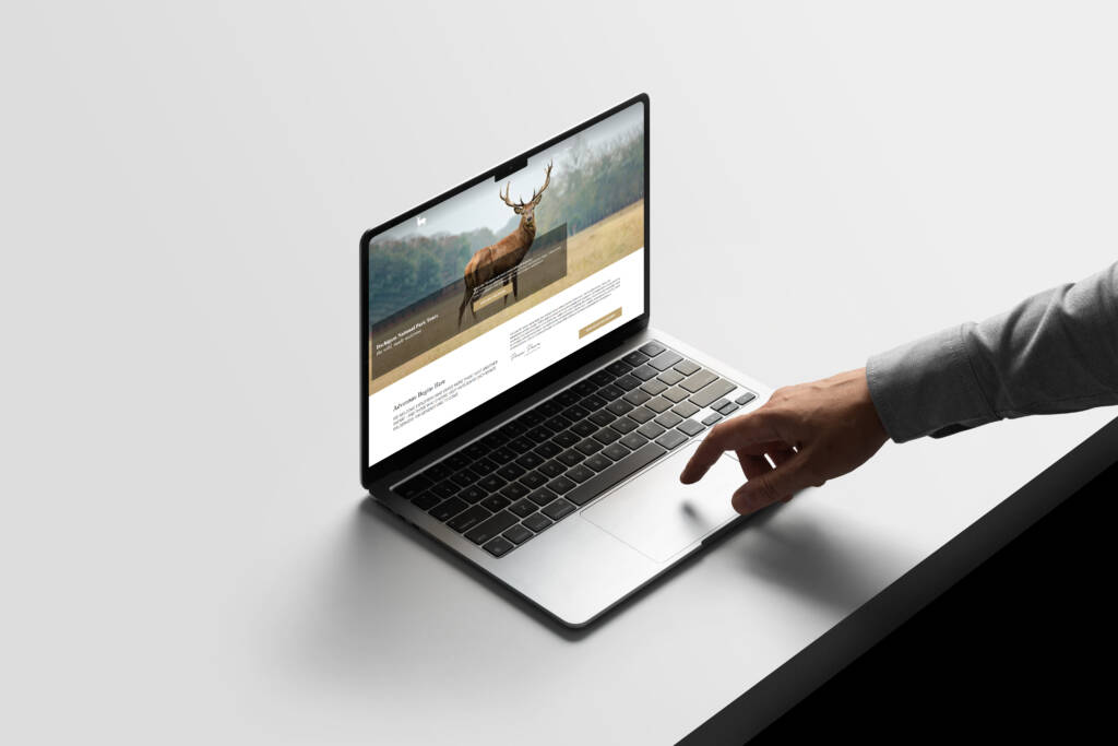
Brand Dachigam National Park Tours is a premium, eco-friendly travel brand that showcases Kashmir’s wild heart—pristine valleys, alpine lakes, and the iconic Hangul (Kashmir red deer). We built a warm, nature-first identity that feels trusted, local, and high-end—designed to attract families, photographers, and wildlife lovers.Dachigam National Park tours, Kashmir wildlife safari, Hangul deer sightings, birdwatching in Srinagar, guided treks Kashmir, eco-tourism permits. Challenge The experience is rich, but information online was scattered. We needed one brand that: Builds trust with real itineraries, safety notes, and conservation messaging. Explains safaris, day trips, permits, and best seasons clearly. Looks premium yet friendly across website, brochures, tickets, and social. Loads fast and ranks for high-intent searches like “Dachigam tour from Srinagar” and “Kashmir wildlife safari.” Solution Wawdler developed a complete, scalable brand system around the existing logo. Logo & Visual System: a clean wordmark with a Hangul antler motif; earthy greens, glacial blues, and natural textures; accessible typography for easy reading on mobile. Website (UI/UX + SEO): fast pages, clear itineraries (half-day, full-day, birding, photography, trek), dynamic FAQs, reviews, and strong CTAs. Semantic headings, schema markup, internal linking, image alt text, and compressed media for top performance. Content & Messaging: simple, benefit-led copy—what you see, how long it takes, what to carry, permit help, safety and conservation. Location cues (Srinagar pickup, Harwan gate, Upper/Lower Dachigam) to match user intent. Collateral Suite: enquiry forms, WhatsApp handoff, and email templates; pricing tables and “what’s included” modules to reduce questions. Result The brand feels clear, credible, and easy to book. Visitors land on itineraries in fewer clicks, time-on-page is higher, and queries arrive with the right details (dates, group size, interests). Pages targeting “Dachigam National Park tour,” “Kashmir wildlife safari,” and “birdwatching Srinagar” rank better thanks to fast loading, structured content, and rich snippets.Every touchpoint—web, print, and on-ground—tells one story: safe, responsible, memorable wildlife experiences in Dachigam, designed for nature lovers and delivered with local expertise.
AI & Quantum Futures Alliance (AIQFA)

Brand AI & Quantum Futures Alliance (AIQFA) is a global nonprofit that brings together leaders in artificial intelligence and quantum computing to drive ethical innovation, policy alignment, and real-world impact. Our brief: create a full, modern brand that signals trust, neutrality, and scientific excellence—while making complex ideas easy to understand online. AI policy, quantum research alliance, AI safety, ethical AI, quantum talent development, global tech standards. Challenge AIQFA needed a single, credible identity across everything—logo, website, research reports, fellowships, events, and partner outreach. The brand had to speak to academics, industry, and governments at once; feel impartial and international; and support long-form content, citations, and program pages that rank for high-intent keywords. Solution Logo & Visual System: a precise, future-forward mark that blends “network” and “quantum lattice” cues; refined wordmark; modular grid; accessible color palette with calm neutrals and a signature accent. Typography & Data-Viz: readable type for papers and policy briefs, standardized charts, diagrams, and figure captions for research credibility. Website (UI/UX + SEO): fast architecture, clear IA for Programs, Research, Policy, and Membership; semantic headings, schema markup, internal linking, and optimized landing pages for “AI policy,” “quantum standards,” and “AI safety fellowships.” Content Playbook: plain-English messaging, evidence-led tone, reusable templates for grants, RFIs, event pages, and partner MOUs; newsroom and publications system with filters and tags. Collateral Suite: report layouts, executive summaries, slide templates, fellowship kits, event signage, badges, social templates, and media kits—print-ready and consistent worldwide. Result AIQFA now presents a clear, trusted voice across web and print, making it easier for partners, researchers and policymakers to find programs, fund projects, and join initiatives. The site structure improves discoverability for priority topics (AI safety, quantum standards, policy frameworks), while fast pages and strong CTAs increase inquiries and membership growth. With one cohesive design system, every report, event, and announcement feels part of the same mission, ethical, global, and future-ready.
Anand & Pawa

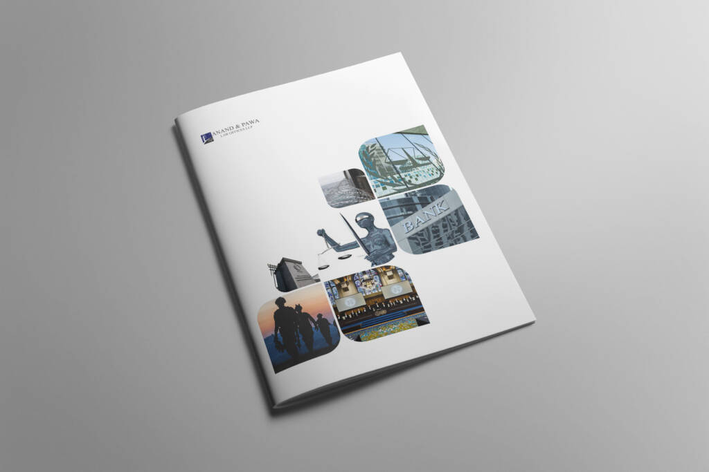
Brand Anand & Pawa is a business-law firm focused on corporate advisory, transactions, and dispute resolution. Our goal was to give the firm a modern identity that feels expert, trustworthy, and easy to approach online.Corporate law firm, business lawyers, contracts & compliance, dispute resolution, M&A lawyers, legal advisory in India. Challenge Anand & Pawa needed one clean brand across every touchpoint, logo, website, stationery, brochures, pitch decks, and templates. The identity had to look premium yet simple, communicate services clearly, and help the firm rank for high-intent legal keywords while loading fast on all devices. Solution Logo & Visual System: a confident wordmark with a precise monogram, balanced grids, calm neutrals with a signature accent, and highly readable typography. Website (UI/UX + SEO): fast pages, clear navigation, service and industry pages with structured headings, schema markup, compressed images, and internal linking to improve time-on-site and conversions. Content & Messaging: plain-English copy focused on outcomes, contracts, compliance, due diligence, litigation strategy, and deal support, with clear CTAs for consultations. Collateral Suite: stationery, proposal decks, case-study one-pagers, thought-leadership layouts, social media templates, and document covers, consistent, print-ready, and easy for the team to use. Result The new identity makes Anand & Pawa look sharp, credible, and client-ready across web and print. The website is faster, easier to navigate, and targets high-value keywords, driving more qualified enquiries. Partners now use unified decks and documents that speed up proposals and improve client confidence. One brand, many touchpoints, professional, modern, and built to win trust.
Is graphic design a talent or skill?

If 2024–25 was the season of loud demos and “we’ll fix it in post,” 2026 is about quiet intent. The best work feels tactile and considered—technology helps the craft, not the other way round. This guide curates ten ideas you can test in two weeks across brand, product, packaging, and content. 1) Calm Tech as a Style Guide Design that communicates without shouting: fewer alerts, purposeful animation, and generous white space. Try: Document a single “calm rule” for every interface element (e.g., If nothing changes, nothing moves). Audit your last five assets against the rule. 2) Tactile Realism Texture returns—paper grain, linen, brushed metal, vellum. The trick is restraint: one tactile cue per composition. Use cases: hero banners, packaging key visuals, publication covers.Pitfall: Avoid heavy compression that muddies grain; export with a higher bitrate. 3) Kinetic Micro‑Interactions Motion earns its place when it explains system logic. Buttons should settle, cards should anticipate, toasts should acknowledge. Spec: 120–180ms for hover; 220–280ms for commit; use cubic‑bezier easing that feels organic. 4) AI as a Co‑Designer Great for divergent exploration (moodboards, colourways, type pairings). Poor at intent. Use AI for breadth, humans for truth. Disclose your use in case studies. Ritual: “10 in 10”—ten low‑stakes variations in ten minutes, pick one to refine manually. 5) Spatial & Ambient Interfaces Think AR as moments, not entire apps—wayfinding dots, 3D product bursts, subtle depth that obeys real‑world light and scale. Prototype: A 15‑second 3D exploded view that clarifies a feature; ensure the default experience is still great without AR. 6) Variable Type & Confident Minimal Palettes Variable fonts give responsive nuance. 2026 palettes: two refined neutrals plus a decisive accent (citrine, azure, vermilion). Rule: If everything pops, nothing pops. Reserve accent for verbs, CTAs, and data highlights. 7) Photography that Breathes Macro texture (weave, grain), human scale (hands interacting), and time cues (slow shutters, golden hour). Sequence shots as macro → context → human moment. 8) Sonic & Haptic Signatures Small, tuned sounds (<400ms) paired with subtle haptics create brand “truth.” Start with three events: add‑to‑cart, confirmation, error. 9) Editorial Grids + Modular Systems Blend an editorial baseline grid with reusable components. Build a “layout lab” page to stress‑test worst‑case copy and translations. 10) Circular Packaging that Performs Mono‑materials, recyclable inks, glue‑light construction, and unboxing beats designed for video. 3‑second rule: from 1 metre, a shopper should grasp name, variant, and benefit. A 2‑Week Experiment Sprint
How to Build a Strong Startup Brand

1) Founder Narrative → Category POV Tell the moment you noticed the problem. Turn that story into a point of view on the category. (What’s broken? What will you do differently?) 2) Promise → Proof Write one promise in 12 words. List 5 proofs (features, policies, social proof) that make it believable. If proof is thin, fix product first. 3) Name, Voice, and Visual System 4) Distinctive Assets Pick 2–3 fluent devices: a shape language, a sonic sting, a sign‑off phrase. Use them everywhere until they’re memory. 5) Zero‑to‑One Launch Plan (100 Days) 6) Measurement that Grows Up Track aided/unaided recall, direct traffic, win rates, and CAC payback—not just likes. Run quarterly asset consistency audits. FAQ Q1. Do we need a logo first? No—get the promise and POV right; visuals flow from that.Q2. Budget tips? Spend on strategy and templates; rent fancy production later.
-Fresh design ideas & inspiration for 2025

QProin faucibus nec mauris a sodales, sed elementum mi tincidunt. Sed eget viverra egestas nisi in consequat. Fusce sodales augue a accumsan. Cras sollicitudin, ipsum eget blandit pulvinar. Integer tincidunt. Cras dapibus. Vivamus elementum semper nisi. Aenean vulputate eleifend tellus. Aenean leo ligula, porttitor eu, consequat vitae, eleifend ac, enim. Sed ut perspiciatis, unde omnis iste natus error sit voluptatem accusantium doloremque laudantium, totam rem aperiam eaque ipsa, quae ab illo inventore veritatis et quasi architecto beatae vitae dicta sunt, explicabo. At vero eos et accusam Sed ut perspiciatis, unde omnis iste natus error sit voluptatem accusantium doloremque laudantium, totam rem aperiam eaque ipsa, quae ab illo inventore veritatis et quasi architecto beatae vitae dicta sunt. Ut perspiciatis, unde omnis iste natus error sit voluptatem accusantium doloremque laudantium, totam rem aperiam eaque ipsa, quae ab illo inventore veritatis et quasi architecto beatae vitae dicta sunt, explicabo. Sed ut perspiciatis, unde omnis iste natus error sit voluptatem accusantium doloremque laudantium, totam rem aperiam eaque ipsa, quae ab illo inventore veritatis et quasi architecto beatae vitae dicta sunt, explicabo. Lorem ipsum dolor sit amet, consectetur adipisicing elit, sed do eiusmod tempor incididunt ut labore et dolore magna aliqua. Ut enim ad minim veniam, quis nostrud exercitation ullamco laboris nisi ut aliquip ex ea commodo consequat. Duis aute irure dolor in reprehenderit. Lorem ipsum dolor sit amet, consectetur adipiscing elit. Curabitur varius eros et lacus rutrum consequat. Mauris sollicitudin enim condimentum, luctus justo non, molestie nisl. Lorem ipsum dolor sit amet, consectetur adipisicing elit, sed do eiusmod tempor incididunt ut labore et dolore magna aliqua. Ut enim ad minim veniam, quis nostrud exercitation ullamco laboris nisi ut aliquip ex ea commodo consequat. Duis aute irure dolor in reprehenderit. Lorem ipsum dolor sit amet, consectetur adipiscing elit. Creative approach to every project Aenean et egestas nulla. Pellentesque habitant morbi tristique senectus et netus et malesuada fames ac turpis egestas. Fusce gravida, ligula non molestie tristique, justo elit blandit risus, blandit maximus augue magna accumsan ante. Duis id mi tristique, pulvinar neque at, lobortis tortor. Lorem ipsum dolor sit amet, consectetur adipisicing elit, sed do eiusmod tempor incididunt ut labore et dolore magna aliqua. Ut enim ad minim veniam, quis nostrud exercitation ullamco laboris nisi ut aliquip ex ea commodo consequat. Duis aute irure dolor in reprehenderit. Lorem ipsum dolor sit amet, consectetur adipiscing elit. Etiam vitae leo et diam pellentesque porta. Sed eleifend ultricies risus, vel rutrum erat commodo ut. Praesent finibus congue euismod. Nullam scelerisque massa vel augue placerat, a tempor sem egestas. Curabitur placerat finibus lacus.
