Visual Content Tips for Luxury Brands

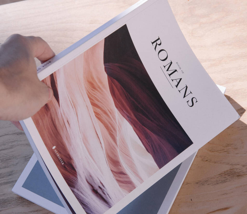
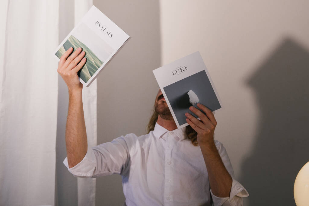
The Luxury Code: Less, Slower, Closer Luxury isn’t loud. It’s controlled. The visual language signals time, craft, and restraint. Here’s a template you can apply to shoots, edits, and social. 1) Light & Negative Space Great luxury shots feel like they have room to breathe. 2) Texture & Macro Show the weave, the stitching, the patina. Macro shots become proof of craft. 3) Pacing & Edit Rhythm Premium feels slower. Hold shots an extra beat. Use J‑cuts to lead sound into the next scene. On social, design sequences: detail → context → human moment. 4) Colour Discipline Two core tones plus one accent keeps the feed coherent. Use the accent sparingly (CTA, signature object, or season marker). 5) Typography Hierarchy Use a refined primary (serif or neo‑grotesk) and a humanist secondary. Track out caps slightly for air; keep body 16–18px. 6) Motion that Serves Meaning Micro‑interactions should feel like the object’s physics. Cushiony easing for leather; crisp snap for machined metal. 7) UGC, Curated like a Gallery Repost sparingly and on brief. Provide mood, angles, and colour guide to creators; require raw files for grading continuity. 8) Scarcity & Ritual Show limited runs via numbering, behind‑the‑scenes finishing, or drop countdowns. Build rituals: unboxing cloth, care card, handwritten note. 9) Measurement that Respects Brand Track brand lift and quality engagement (saves, DMs, wishlist adds), not vanity views. Pair with cohort‑based revenue. Luxury Shoot Checklist FAQ
Social “Entertaining” Content Trends for 2026

What’s Working Now Audiences want three things: a reason to return (series), a role to play (co‑creation), and something useful (utility memes, templates, checklists). 1) Snackable Series Theme + consistent hook + fixed runtime (e.g., 20 seconds). Examples: One‑Good‑Idea Fridays, 60‑Second Brand Roasts, Palette of the Week. 2) Live Co‑Creation Co‑edit a logo, grade a photo together, or poll storyboards in real time. Save the live and cut highlights for Reels/Shorts. 3) Utility Memes Humour that teaches (frameworks, checklists, prompts). Package in carousels with strong first slide value. 4) Silent‑First Storytelling Design for sound‑off: bold supers, rhythm editing, gesture language, concise captions. 5) Lo‑Fi Prestige Handheld, natural light, unpolished sincerity—paired with premium colour and typography overlays. 30‑Day Content Lab (Repeatable) Metrics that Matter Saves, profile taps, replies, and watch‑through. Diagnose drop‑off frames and reshoot those beats. FAQ
New Trends in Product Design (2026)
The Shift: Durable, Legible, Responsible The post‑gadget hangover is real. 2026 product design celebrates things that last, systems that explain themselves, and features users can trust. 1) Circular & Modular by Default Standard fasteners, replaceable batteries, labelled parts, and material passports. Win: Lower lifetime cost, easier upgrades, and story value. 2) Calm Tech Interfaces Interfaces that narrate only when needed. Hierarchy first, animation second. 3) Honest AI Call out AI‑assisted features clearly. Let users opt into training data. Provide a visible “why” for recommendations. 4) Inclusive Ergonomics Design for small hands, left‑handed use, and low dexterity. Consider contrast, tactile cues, and non‑visual feedback. 5) Haptics & Affordances Subtle ridges, detents, and textures that guide touch. Tune haptics to match material truth. 6) Packaging that Educates QR quick‑start, on‑pack repair score, and a 30‑second video for first use. Validation Loop (2 Weeks) Decide + document Hypothesis + success metric Cardboard/3D print mock 5 user sessions (think‑aloud) Iterate Pilot in the wild (2–3 days)
What’s Coming in Graphic Design 2026?

1) Kinetic Type with Purpose Motion supports meaning—verbs move, nouns hold. Build a motion style sheet with durations, easings, and use‑cases. 2) Neo‑Skeuomorphism (Used Wisely) Subtle shadows, tactile edges, glass and vellum hints. Combine with crisp grids so it stays premium, not kitsch. 3) Variable Type Everywhere Tweak width/weight/grade responsively instead of swapping families. It simplifies systems and keeps voice consistent. 4) Eco‑Minimal Colour Calming neutrals with sparing, high‑chroma accents. Prioritise contrast ratios for accessibility. 5) Photographic Story Systems Build sequences (macro → context → human). Grade consistently with a house LUT. 6) Template Discipline Design once, deploy widely. A few great templates do more for brand than a dozen one‑offs. FAQ Q1. Which trend lasts? Variable type + template discipline—timeless infrastructure.Q2. Print in 2026? Alive and well when curated: small runs, textured stocks, specialty finishes.llentesque porta. Sed eleifend ultricies risus, vel rutrum erat commodo ut. Praesent finibus congue euismod. Nullam scelerisque massa vel augue placerat, a tempor sem egestas. Curabitur placerat finibus lacus.
Hardware & Software for Designers (2026)
nitor for designers, designer software 2026, colour calibration The Non‑Negotiables Good‑Better‑Best (Indicative) Software Core Calibration & Colour Management Calibrate monthly; keep a single working colour space per project; lock export presets. FAQ Q1. Do I need a workstation? Not if your projects are 2D; for 3D/MR, yes.Q2. Cheapest upgrade? A colour‑accurate display + calibration puck. CTA
How to Design a Winning Marketing Campaign
The Framework Make the Brief Unbreakable Ideas that Travel Design a core gestalt (shape, phrase, behaviour) that flexes across OOH, social, email, site, and PR. Asset Map Example Measurement Pre‑test (ad recall), in‑flight (watch‑through, CTR), endline (lift study, sales). Document learnings. FAQ Q1. How many concepts to test? Three. Kill two decisively.Q2. In‑house vs agency? Blend: you own truth; we add pattern recognition.o et diam pellentesque porta. Sed eleifend ultricies risus, vel rutrum erat commodo ut. Praesent finibus congue euismod. Nullam scelerisque massa vel augue placerat, a tempor sem egestas. Curabitur placerat finibus lacus.
When Is the Right Time to Rebrand?
Five Clear Signals The Rebrand Ladder Risk & ROI Protect equity by retaining distinctive assets users recognise. Stage rollout to reduce shock. FAQ Q1. How often to rebrand? When strategy changes—not on a calendar.Q2. What costs most? Inertia and inconsistency.
Colour Psychology: Use Colour to Drive Sales
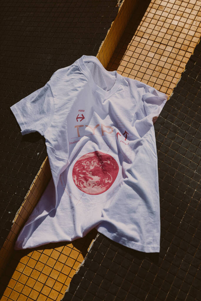
What Colour Really Does Colour sets emotional expectation and clarifies hierarchy. It doesn’t close a sale alone—but it nudges hard. 1) Map Emotions to Missions 2) Culture & Context Colours carry regional meanings; test locally. Always consider sector codes (healthcare ≠ finance ≠ gaming). 3) Accessibility First Contrast ratios matter. Design the CTA state sequence (default/hover/active/disabled) to stay compliant and clear. 4) Hierarchy via Colour Jobs Give every colour a job: information, emphasis, or decoration. Decoration is the first to go when simplifying. 5) Testing Plan A/B two palette treatments on the same layout; isolate a single variable (accent or background). Track CTR, completion, and time on task. FAQ Q1. Should the CTA always be red? No; it should be the most salient colour vs surroundings.Q2. Can we use many colours? Yes—if each has a job and meets contrast standards. diam pellentesque porta. Sed eleifend ultricies risus, vel rutrum erat commodo ut. Praesent finibus congue euismod. Nullam scelerisque massa vel augue placerat, a tempor sem egestas. Curabitur placerat finibus lacus.
How to Develop a Memorable Brand

Memory Is a System, Not a Logo Memorability compounds when visual, verbal, sonic, and behavioural cues repeat consistently across touchpoints. 1) Distinctive Assets Catalogue what’s already working: colour, shape, mascot/device, sonic sting, sign‑off phrase. Protect and amplify. 2) Fluent Device A repeated character, gesture, or pattern that frames messages (e.g., a bracketed phrase, a signature angle, a sticker). 3) Story Rituals Create recurring content rituals (e.g., Founders’ Friday Note). Rituals train audiences to expect and remember. 4) Sonic Identity Micro‑sounds for app events and motion stings for video bumpers. Keep them short and tuned. 5) Consistency vs Novelty 80% consistency, 20% seasonal novelty. Novelty lives inside the frame your assets create. FAQ Q1. Isn’t this limiting? It’s liberating; you spend less on recognition and more on ideas.Q2. What to track? Asset recall, brand attribution, distinctive asset recognition.
Ramp Up Sales with a Creative Promotion

Choose Your Mechanic Design the Experience Clear calendar, landing + FAQ, channel‑specific cuts, and a no‑gotcha policy. Plan fulfilment before announcement. Scarcity without Stress Limited editions, numbered items, or timed windows—communicated calmly, not frantically. Post‑Mortem Discipline Did it grow customer quality (LTV, repeat rate) or just spike one‑time sales? Keep what compounds. FAQ Q1. Should we discount? Prefer value‑add or access to protect brand equity.Q2. How long? 5–10 days is ideal for momentum without fatigue.
-Best marketing campaigns you should see
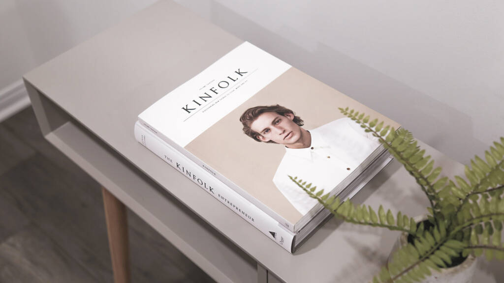
QProin faucibus nec mauris a sodales, sed elementum mi tincidunt. Sed eget viverra egestas nisi in consequat. Fusce sodales augue a accumsan. Cras sollicitudin, ipsum eget blandit pulvinar. Integer tincidunt. Cras dapibus. Vivamus elementum semper nisi. Aenean vulputate eleifend tellus. Aenean leo ligula, porttitor eu, consequat vitae, eleifend ac, enim. Sed ut perspiciatis, unde omnis iste natus error sit voluptatem accusantium doloremque laudantium, totam rem aperiam eaque ipsa, quae ab illo inventore veritatis et quasi architecto beatae vitae dicta sunt, explicabo. At vero eos et accusam Sed ut perspiciatis, unde omnis iste natus error sit voluptatem accusantium doloremque laudantium, totam rem aperiam eaque ipsa, quae ab illo inventore veritatis et quasi architecto beatae vitae dicta sunt. Ut perspiciatis, unde omnis iste natus error sit voluptatem accusantium doloremque laudantium, totam rem aperiam eaque ipsa, quae ab illo inventore veritatis et quasi architecto beatae vitae dicta sunt, explicabo. Sed ut perspiciatis, unde omnis iste natus error sit voluptatem accusantium doloremque laudantium, totam rem aperiam eaque ipsa, quae ab illo inventore veritatis et quasi architecto beatae vitae dicta sunt, explicabo. Lorem ipsum dolor sit amet, consectetur adipisicing elit, sed do eiusmod tempor incididunt ut labore et dolore magna aliqua. Ut enim ad minim veniam, quis nostrud exercitation ullamco laboris nisi ut aliquip ex ea commodo consequat. Duis aute irure dolor in reprehenderit. Lorem ipsum dolor sit amet, consectetur adipiscing elit. Curabitur varius eros et lacus rutrum consequat. Mauris sollicitudin enim condimentum, luctus justo non, molestie nisl. Lorem ipsum dolor sit amet, consectetur adipisicing elit, sed do eiusmod tempor incididunt ut labore et dolore magna aliqua. Ut enim ad minim veniam, quis nostrud exercitation ullamco laboris nisi ut aliquip ex ea commodo consequat. Duis aute irure dolor in reprehenderit. Lorem ipsum dolor sit amet, consectetur adipiscing elit. Creative approach to every project Aenean et egestas nulla. Pellentesque habitant morbi tristique senectus et netus et malesuada fames ac turpis egestas. Fusce gravida, ligula non molestie tristique, justo elit blandit risus, blandit maximus augue magna accumsan ante. Duis id mi tristique, pulvinar neque at, lobortis tortor. Lorem ipsum dolor sit amet, consectetur adipisicing elit, sed do eiusmod tempor incididunt ut labore et dolore magna aliqua. Ut enim ad minim veniam, quis nostrud exercitation ullamco laboris nisi ut aliquip ex ea commodo consequat. Duis aute irure dolor in reprehenderit. Lorem ipsum dolor sit amet, consectetur adipiscing elit. Etiam vitae leo et diam pellentesque porta. Sed eleifend ultricies risus, vel rutrum erat commodo ut. Praesent finibus congue euismod. Nullam scelerisque massa vel augue placerat, a tempor sem egestas. Curabitur placerat finibus lacus.
How to Master Great Product Packaging
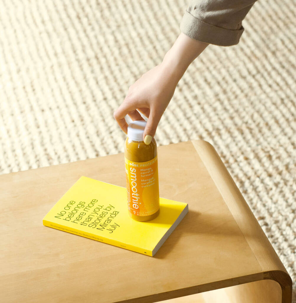
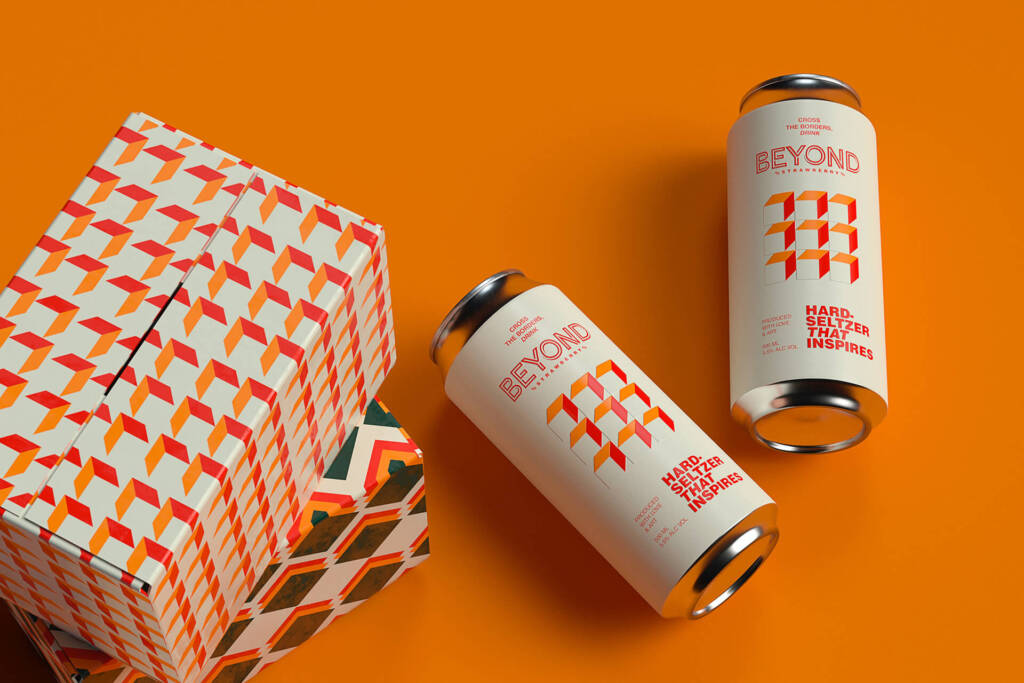
The Three Jobs of Packaging Hierarchy that Sells Name → variant → key benefit → size/qty → claims. Design with the 1‑metre test. Keep claims readable and regulated. Materials & Sustainability Prefer mono‑materials, recyclable inks, and glue‑light structures. Print “how to dispose” icons clearly. Finishes & Texture Use emboss, deboss, foil, and soft‑touch selectively to signal quality. Avoid over‑finishing that hinders recyclability. E‑Com Unboxing Theatre Design repeatable beats: reveal, protection peel, thank‑you card, QR to quick‑start. Pre‑Press Checklist (Printable) FAQ Q1. Small run economics? Gang print where possible; choose finishes that scale.Q2. How to avoid damage? Test with drop/pressure trials; film the process.
