Is graphic design a talent or skill?

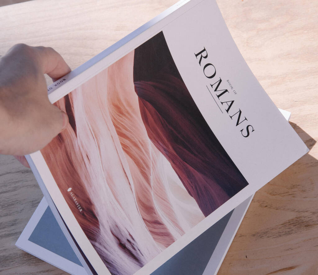
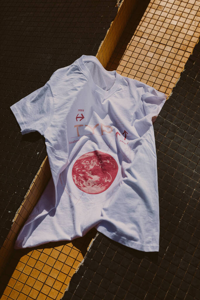
If 2024–25 was the season of loud demos and “we’ll fix it in post,” 2026 is about quiet intent. The best work feels tactile and considered—technology helps the craft, not the other way round. This guide curates ten ideas you can test in two weeks across brand, product, packaging, and content. 1) Calm Tech as a Style Guide Design that communicates without shouting: fewer alerts, purposeful animation, and generous white space. Try: Document a single “calm rule” for every interface element (e.g., If nothing changes, nothing moves). Audit your last five assets against the rule. 2) Tactile Realism Texture returns—paper grain, linen, brushed metal, vellum. The trick is restraint: one tactile cue per composition. Use cases: hero banners, packaging key visuals, publication covers.Pitfall: Avoid heavy compression that muddies grain; export with a higher bitrate. 3) Kinetic Micro‑Interactions Motion earns its place when it explains system logic. Buttons should settle, cards should anticipate, toasts should acknowledge. Spec: 120–180ms for hover; 220–280ms for commit; use cubic‑bezier easing that feels organic. 4) AI as a Co‑Designer Great for divergent exploration (moodboards, colourways, type pairings). Poor at intent. Use AI for breadth, humans for truth. Disclose your use in case studies. Ritual: “10 in 10”—ten low‑stakes variations in ten minutes, pick one to refine manually. 5) Spatial & Ambient Interfaces Think AR as moments, not entire apps—wayfinding dots, 3D product bursts, subtle depth that obeys real‑world light and scale. Prototype: A 15‑second 3D exploded view that clarifies a feature; ensure the default experience is still great without AR. 6) Variable Type & Confident Minimal Palettes Variable fonts give responsive nuance. 2026 palettes: two refined neutrals plus a decisive accent (citrine, azure, vermilion). Rule: If everything pops, nothing pops. Reserve accent for verbs, CTAs, and data highlights. 7) Photography that Breathes Macro texture (weave, grain), human scale (hands interacting), and time cues (slow shutters, golden hour). Sequence shots as macro → context → human moment. 8) Sonic & Haptic Signatures Small, tuned sounds (<400ms) paired with subtle haptics create brand “truth.” Start with three events: add‑to‑cart, confirmation, error. 9) Editorial Grids + Modular Systems Blend an editorial baseline grid with reusable components. Build a “layout lab” page to stress‑test worst‑case copy and translations. 10) Circular Packaging that Performs Mono‑materials, recyclable inks, glue‑light construction, and unboxing beats designed for video. 3‑second rule: from 1 metre, a shopper should grasp name, variant, and benefit. A 2‑Week Experiment Sprint
Hardware & Software for Designers (2026)

nitor for designers, designer software 2026, colour calibration The Non‑Negotiables Good‑Better‑Best (Indicative) Software Core Calibration & Colour Management Calibrate monthly; keep a single working colour space per project; lock export presets. FAQ Q1. Do I need a workstation? Not if your projects are 2D; for 3D/MR, yes.Q2. Cheapest upgrade? A colour‑accurate display + calibration puck. CTA
Colour Psychology: Use Colour to Drive Sales

What Colour Really Does Colour sets emotional expectation and clarifies hierarchy. It doesn’t close a sale alone—but it nudges hard. 1) Map Emotions to Missions 2) Culture & Context Colours carry regional meanings; test locally. Always consider sector codes (healthcare ≠ finance ≠ gaming). 3) Accessibility First Contrast ratios matter. Design the CTA state sequence (default/hover/active/disabled) to stay compliant and clear. 4) Hierarchy via Colour Jobs Give every colour a job: information, emphasis, or decoration. Decoration is the first to go when simplifying. 5) Testing Plan A/B two palette treatments on the same layout; isolate a single variable (accent or background). Track CTR, completion, and time on task. FAQ Q1. Should the CTA always be red? No; it should be the most salient colour vs surroundings.Q2. Can we use many colours? Yes—if each has a job and meets contrast standards. diam pellentesque porta. Sed eleifend ultricies risus, vel rutrum erat commodo ut. Praesent finibus congue euismod. Nullam scelerisque massa vel augue placerat, a tempor sem egestas. Curabitur placerat finibus lacus.
Ramp Up Sales with a Creative Promotion

Choose Your Mechanic Design the Experience Clear calendar, landing + FAQ, channel‑specific cuts, and a no‑gotcha policy. Plan fulfilment before announcement. Scarcity without Stress Limited editions, numbered items, or timed windows—communicated calmly, not frantically. Post‑Mortem Discipline Did it grow customer quality (LTV, repeat rate) or just spike one‑time sales? Keep what compounds. FAQ Q1. Should we discount? Prefer value‑add or access to protect brand equity.Q2. How long? 5–10 days is ideal for momentum without fatigue.
